GNUPLOT
If this had worked quickly, I wouldn't make a webpage about it.
Tips
Use pngcairo instead of png.
stats 'datafile' u 1
generate some dummy data points
gen-polar-dat.tcsh:
#!/bin/tcsh -f
echo "# long lat lat*100" > polar-test.dat
foreach i (`seq 30 60`)
foreach j (`seq -w -20 2 20`)
echo "$j $i "`echo "$i * 100"| bc -l` >> polar-test.dat
end
end
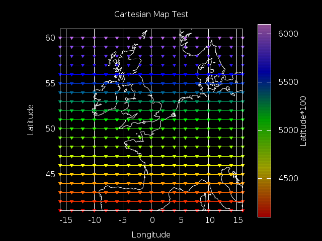
Simple cartesian lat,lon plot
cartesian-test.gnu:
# plot lat/long points as is in cartesian plane
reset
file='polar-test.dat'
set title "Cartesian Map Test" textcolor rgb "white"
set cblabel "Latitude*100" textcolor rgb "white"
set term pngcairo background "#000000"
set output 'cartesian-test.png'
#Greenwich observatory
lat1=51.48
lon1=0
set palette defined ( 0 "red", 1 "yellow", 2 "green", 3 "blue", 4 "violet" )
set style fill transparent solid 0.6 noborder
set size square
set origin -0.1 ,0
set grid ls 3 lc rgb "white"
set border lc rgb "white"
set xrange [-16:16]
set yrange [41:61]
set xlabel "Longitude" textcolor rgb "white"
set ylabel "Latitude" textcolor rgb "white"
set cbrange [4100:6100]
set colorbox user origin .8,.1 size .04,.8
plot 'world_50m.txt' u ($1):($2) w l ls 2 lc rgb "white" notitle,\
 file u ($1):($2):($3) w linespoints pt 11 ps 1 lc palette notitle

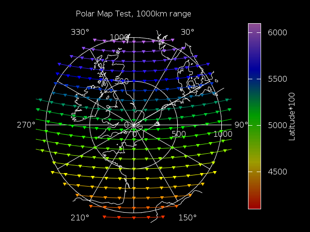
Polar plot of the same dataset
# plot points in polar coordinates with range and bearing
reset
set angles degrees
file='polar-test.dat'
set title "Polar Map Test, 1000km range from Grenwich" textcolor rgb "white"
set cblabel "Latitude*100" textcolor rgb "white"
set term pngcairo background "#000000"
set output 'polar-test.png'
#Greenwich observatory
lat1=51.48
lon1=0
maxrad=1110
set palette defined ( 0 "red", 1 "yellow", 2 "green", 3 "blue", 4 "violet" )
set style fill transparent solid 0.6 noborder
set polar
set size square
set origin -0.1 ,0
set grid ls 3 lc rgb "white"
set grid polar 30
set border lc rgb "white"
unset border
set xtics axis
set ytics axis
set rrange [0:maxrad]
set xtics scale 0 #"remove" the tics so that only the y tics are displayed
set xtics ("" 50, "" 100, "" 150, "" maxrad)
set ytics scale 0
set ytics 0, 500, maxrad
# Make a label at the edges of the target
set_label(x, text) = sprintf("set label '%s' at (maxrad*1.1*cos(%f)), (maxrad*1.1*sin(%f)) center textcolor rgb \"white\"", text, x, x)
eval set_label(0, "90°")
eval set_label(60, "30°")
eval set_label(120, "330°")
eval set_label(180, "270°")
eval set_label(240, "210°")
eval set_label(300, "150°")
set cbrange [4100:6100]
set colorbox user origin .8,.1 size .04,.8
plot 'world_50m.txt' u (atan2((sin($1-lon1)*cos($2)),(cos(lat1)*sin($2)-sin(lat1)*cos($2)*cos($1-lon1)))*-1+90):\
(acos(sin($2)*sin(lat1)+cos($2)*cos(lat1)*cos($1-lon1))*6371*pi/180) with l ls 2 lc rgb "white" notitle,\
file u (atan2((sin($1-lon1)*cos($2)),(cos(lat1)*sin($2)-sin(lat1)*cos($2)*cos($1-lon1)))*-1+90):\
(acos(sin($2)*sin(lat1)+cos($2)*cos(lat1)*cos($1-lon1))*6371*pi/180):($3) w linespoints pt 11 ps 1 lc palette notitle

Serious thanks to this stackoverflow post to get this working and to movable-type.co.uk for the sanitized bearing and range code.
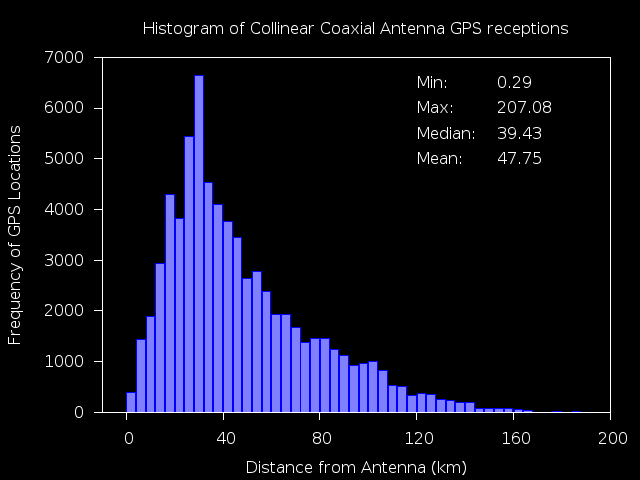
Histogram
## gnuplot to histogram.png
reset
file='plottmp6'
set angles degrees
lat1=0
lon1=0
n=50 #number of intervals
max=200. #max value
min=0. #min value
width=(max-min)/n #interval width
#function used to map a value to the intervals
hist(x,width)=width*floor(x/width)+width/2.0
#set term png #output terminal and file
set term pngcairo background "#000000"
set border lc rgb "white"
set output "histogram6.png"
set xrange [min:max]
set yrange [0:]
#to put an empty boundary around the
#data inside an autoscaled graph.
set offset graph 0.05,0.05,0.05,0.0
set xtics min,(max-min)/5,max
set boxwidth width*0.9
set style fill solid 0.5 #fillstyle
set tics out nomirror
stats file u (acos(sin($2)*sin(lat1)+cos($2)*cos(lat1)*cos($1-lon1))*6371*pi/180)
set label 1 "Min:\t\t%.2f",STATS_min textcolor rgb "white" at 120,6500
set label 2 "Max:\t%.2f",STATS_max textcolor rgb "white" at 120,6000
set label 3 "Median:\t%.2f",STATS_median textcolor rgb "white" at 120,5500
set label 4 "Mean:\t%.2f",STATS_mean textcolor rgb "white" at 120,5000
set xlabel "Distance from Antenna (km)" textcolor rgb "white"
set ylabel "Frequency of GPS Locations" textcolor rgb "white"
set title "Histogram of Collinear Coaxial Antenna GPS receptions" textcolor rgb "white"
#count and plot
plot file u (hist((acos(sin($2)*sin(lat1)+cos($2)*cos(lat1)*cos($1-lon1))*6371*pi/180),width)):(1.0) smooth freq w boxes lc rgb"blue" notitle
